Forum archives » Photoshop Valley » My Computer Art, Do I have potential?

Beeko180
April 16, 2009 1:26 AM

Here's a self portrait that I'm going to ty and sumbit for the forumusers column:

Post #270347link

not_Scyess
April 16, 2009 8:01 AM

Perhaps you can draw yourself in a less boring position?  We have enough white male characters who are just standing there.

Although most of them have better haircuts.

Post #270353link

Beeko180
April 16, 2009 2:10 PM

Thanks for the tip.

Post #270362link

Injokester
April 16, 2009 4:53 PM

Nice! I love the style.

I'd recommend drawing larger than that though and shrinking it down - that just removes the pixellation on the hard lines and smoothes them out a little. Just make sure to keep them fairly jagged and uneven in places, that's what makes this for me :)

Post #270372link

Beeko180
April 16, 2009 5:11 PM

Thanks. Seeming Your comment came up after I did another drawing I've used not_Scyess' advice first, here is a different pose:

Post #270374link

ArtemisStrong
April 16, 2009 6:54 PM

Dude, these are odd enough to be worthwhile.

More poses, though! I'm dying still to have someone reading a book or newspaper.

And some reactions (shocked, laughing, pissed, bug-eyed green-skinned with cheeks full of vomit) are in order, most of our characters exhibit a limited range of emotion.

Post #270378link

Beeko180
April 16, 2009 8:03 PM

quote:

ArtemisStrong wrote:

Dude, these are odd enough to be worthwhile.

More poses, though! I'm dying still to have someone reading a book or newspaper.

And some reactions (shocked, laughing, pissed, bug-eyed green-skinned with cheeks full of vomit) are in order, most of our characters exhibit a limited range of emotion.


 Thanks for the ideas ArtemisStrong

I'll go with the one in bold first, seeming it looks like a challenge, and I like challenges:


Ok, maybe it didn't work out very well, but at least I had the initiative to try......


Post #270379link

Beeko180
April 16, 2009 10:20 PM

Even if I can do this sort of stuff, I still can't seem to shrink it to the size it has to be for me to submit it to Brad. I tried what Injokester said and it did the same thing, it just goes pixal on me. And when I save it as a GIF it loses some of the colour data and therefore it goes all line like. Any help?

Post #270382link

Injokester
April 16, 2009 10:41 PM

What program are you using? If it's paint that'll be the problem, it isn't capable of resizing or saving as gif without totally destroying your work...

I'd recommend using photoshop, even if you don't want to buy it you can download the trial version from adobe's site. You can probably dig up a keygen if you don't mind pirating. I included everything DexX taught me about getting images ready for SC in my paint tutorial.

The other way you might consider is to download Irfanview, which is about 3MB and free. The best way there is to resize your image first and save it as a .png file, then do the edge outline manually in paint, open up in Irfanview again and save as a gif. There's an option when saving to choose the transparent colour, just make sure everything outside the character is the same colour and choose that (fill it with bright pink or something you didn't use anywhere on the character).

Post #270385link

Injokester
April 16, 2009 11:16 PM

Actually, scratch that last bit, I updated my paint topic with proper instructions on how to format characters for SC using Irfanview, check the last post here.

I used your first character as the example :)

Post #270388link

Beeko180
April 16, 2009 11:20 PM

Thanks a bunch!

Post #270389link

Beeko180
April 16, 2009 11:20 PM

Thanks a bunch!

Post #270390link

Beeko180
April 17, 2009 12:29 AM

It worked

Post #270394link

Beeko180
April 17, 2009 12:39 AM

And now I have submitted it. Again, I would like to thank you Injokester.

Post #270396link

Zaster
April 17, 2009 6:00 AM

Not a criticism, just an observation:  barfing guy should probably have his mouth close, lips pursed, no teeth showing.  As a guy who reads alot of not_Scyess'  comics, I know alot about trying to hold in a puke (kidding, kidding). 

Also, a larger version just showing him from the waist up might be cool (more impact, like he's about to chuck on the reader).

Post #270406link

not_Scyess
April 17, 2009 8:21 AM

I knew you were kidding.  No one reads my comics.

Post #270409link

Beeko180
April 17, 2009 2:18 PM

quote:

Zaster wrote:

Not a criticism, just an observation:  barfing guy should probably have his mouth close, lips pursed, no teeth showing.  As a guy who reads alot of not_Scyess'  comics, I know alot about trying to hold in a puke (kidding, kidding). 

Also, a larger version just showing him from the waist up might be cool (more impact, like he's about to chuck on the reader).


Thanks for the tips on the barfing techniques. I felt most of the drawing was a bit messed up. But I have no idea where teeth come into the drawing. I never had teeth showing. 

Post #270414link

ArtemisStrong
April 17, 2009 5:01 PM

Well, the lips look like teeth. You should make the lips a simple straight line to avoid confusion.

Or, well, not exactly a straight line. but you get my drift.


And if you don't get my drift, I mean like this:

See, the mouth is indicated by a simple curved line. Do that with your puke mouth, and it will be fine. I wouldn't change anything else, though. It's perfectly weird enough as is.

Post #270421link

Beeko180
April 17, 2009 5:46 PM

Thanks:


Post #270423link

Zaster
April 18, 2009 2:05 AM

Nice.

 "Don't make me nauseous.  You wouldn't like me when I'm nauseous."

Post #270443link

Beeko180
April 18, 2009 2:11 AM

quote:

Zaster wrote:

Nice.

 "Don't make me nauseous.  You wouldn't like me when I'm nauseous."


:)

Post #270444link

Beeko180
April 20, 2009 12:56 AM

I have absolutely no idea what happened with the finished version because there were green dots around it (either it actually happened or I'm going insane again):


Oh that's fantastic! Now it won't even show! somebody tell me what I'm doing wrong?


Post #270516link

RCCOLAMAN
April 20, 2009 7:38 AM

there you go beeko. I like this alot! just center the image a bit more so that his left hand and the skull are a little bit more to the left!

Maybe i'll give this a try. Too bad I don't have a drawing tablet :( and even if i did I have no guarantees that it would work with linux...

Post #270523link

Beeko180
April 20, 2009 2:36 PM

Thanks, I'll fix the image after school.


Post #270531link

LittleRocker
April 21, 2009 5:14 PM

beeko what grade you in??

Post #270566link

Injokester
April 22, 2009 12:28 AM

quote:

Beeko180 wrote:

I have absolutely no idea what happened with the finished version because there were green dots around it (either it actually happened or I'm going insane again):

Oh that's fantastic! Now it won't even show! somebody tell me what I'm doing wrong?


Not sure why the image didn't show up, but can right click to see properties and the url is correct there.

Anyways, I think where you went wrong was that you filled the background with green before you shrank it - the idea is to create the outline manually after it's at the finished size.

When you shrink an image the application doing it changes the colours, especially where 2 colours meet.

The other possibility is that you saved it as a gif or jpg from ms paint (always use .png format, it preserves your colours and has a nice small file size - convert to jpg or gif from that using another application).

See if either of those is the cause, otherwise I'll need more info to figure out what went wrong. Send me a PM if you need help, I don't check the forums all that often :)

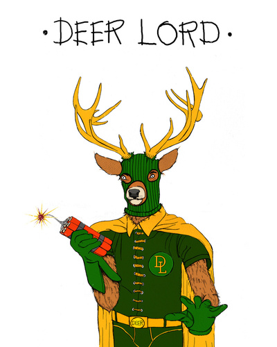
Oh, and love the character!

Post #270587link

Beeko180
April 22, 2009 2:57 PM

Thanks. This is the best I could get it, but at least it worked:


Post #270613link

Injokester
April 23, 2009 4:05 PM

Looks good, though you left 2 pixels of light grey just underneath his right hand ;)

One little tip though - where the left knee is sticking out your line is a little jagged, if you shave one or two pixels from both the top and bottom of the knee it comes out a lot smoother:

Other than that there are a couple of pixels sticking out of the skull, and you could do the same thing with the chin and right elbow as the knee. These things are very minor though (I'm kind of a perfectionist), and overall this came out nicely!

Post #270644link

ArtemisStrong
April 23, 2009 8:47 PM

I think it's the balls.


Now do a guy shuffling through his iPod. I have several iPod jokes I haven't been able to execute yet.

Post #270647link

RCCOLAMAN
April 23, 2009 9:40 PM

I was bored so...

 I hope you don't mind me changing your image beeko, I removed the skull but then couldn't think of anything to put in his hand :(

Post #270648link

Beeko180
April 25, 2009 12:25 AM

quote:

Injokester wrote:

Looks good, though you left 2 pixels of light grey just underneath his right hand ;)

One little tip though - where the left knee is sticking out your line is a little jagged, if you shave one or two pixels from both the top and bottom of the knee it comes out a lot smoother:

Other than that there are a couple of pixels sticking out of the skull, and you could do the same thing with the chin and right elbow as the knee. These things are very minor though (I'm kind of a perfectionist), and overall this came out nicely!


That simple fact that I've just met another perfectionist other than myself is enough to say a considerate thank you. But the fact that you even went to the trouble of correcting my mistakes just shows how much more this thank will mean when I say it:


Thank you.


quote:

RCCOLAMAN wrote:

I was bored so...

 I hope you don't mind me changing your image beeko, I removed the skull but then couldn't think of anything to put in his hand :(


Thank you very much, I'll try to make my version of a guy with an i pod. Although I quite enjoyed the rather exquisite form of shakespear that you have approached RCCOLAMAN. 


Post #270694link

Beeko180
May 2, 2009 8:45 PM

I just realised we don't have a bank background so here we are:

Post #270969link

RCCOLAMAN
May 5, 2009 6:03 PM

I like the vault background a lot beeko, with a little more detail and polish I think it would make a great addition to the site! An open version of the vault would be neat too, with like gold and treasure chests on the inside, you know, bling bling.

Post #271043link

Beeko180
May 5, 2009 11:39 PM

Took a while but here it is, an open versionof the vault!


Post #271047link

LittleRocker
June 23, 2009 7:59 AM

I like. How do you make thesee?

Post #271947link

Beeko180
June 23, 2009 5:21 PM

I do them in paint, I don't have photoshop, but I hear photoshop is better to use (I think).

Post #271955link

Injokester
June 25, 2009 6:13 AM

quote:

LittleRocker wrote:
I like. How do you make thesee?

This might help :)

Post #271991link

Beeko180
July 1, 2009 3:53 AM

I noticed we don't have many hospital backgrounds too, so naturally:


Post #272174link

DragonXero
July 12, 2009 12:39 AM

Actually, if you can pull it off, paint tends to be better for backgrounds than Photoshop, at least in how they come out.  The jaggies actually work for our art here.

Post #272389link

fuckyoupieceofshit
March 14, 2012 12:42 PM

Post #284568link

Forum archives » Photoshop Valley » My Computer Art, Do I have potential?

stripcreator
Make a comic
Forums
featuring
diesel sweeties
jerkcity
exploding dog
goats
ko fight club
penny arcade
chopping block
also
Brad Sucks