In regards to my edges:
Having a look at the edges of other characters that have recently been added I can't see much of a difference between their edges and mine.
What I'm wondering is whether maybe it's something else that makes the edges on my characters stand out. The style I use is very clean, I use smooth lines and little or no shading (similar to the Futurama or Family Guy style, both of which have heavily influenced my work). I've jotted down a few things that come to mind in the hope that we can pinpoint the problem so I can see if I can fix it.
A lot of the other artwork that has been submitted has more of a grittier hand-drawn feel to it, so by comparison the edges don't stand out as much. It could also be the internal lines, which are fairly light on the stuff I've done, which very much contrasts with the outer edges. Shading would also play a big part, as would the omission of fine details- leaving large areas of plain colour, and also the longer smooth lines on the outside (the right arm of the bunny below).
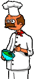
Using Squid's chef as an example you can see everything I'm talking about, and also that the edges are actually about the same- mine just stand out more because they're in contrast to the rest of the character.

Here are the characters with a background behind them as well, since they do look quite different against white. (I went for a fairly neutral background so you can see the various effects on both light and dark colours, and opted not to use a cluttered background which would actually better hide the edges).

Also please bear in mind that when people read cartoons they don't usually study the art, a quick glance to see what's there is all you usually get- who, where and what they're doing. The main focus will always be the facial expressions of the characters. And imperfect artwork doesn't seem to have hurt Tobor's career any...
---
Dinosaurs had eggs bro, the chicken came way later.


 I'd rather not ALWAYS be sporting the forked fingers.. there are times where it would be quite inappropriate.


